Read the financial statements
Every stock, ETF and fund in the catalog has a Financials tab — the company’s own income statement, balance sheet and cash-flow statement, presented to be read rather than decoded, each with a chart of how the money moves.
Where to find them
Open any instrument — from a watchlist, or from Catalog → Securities — and choose the Financials tab. FolioCenter shows the company’s own income statement, balance sheet and cash-flow statement, laid out to be read rather than decoded, each paired with a chart of how the money moves.
As reported, no opinions. The Financials tab presents each company’s filed figures and draws them clearly. It carries no rating, score or recommendation — what the numbers mean for you is yours to judge.
Pick a statement and a period
Three toggles sit above every statement:
- Income · Balance · Cash flow — which of the three statements to show.
- Annual · Quarterly — full fiscal years, or the most recent quarters.
- Current Period · Compare Periods — switch the chart between a single-period diagram and a multi-period comparison.
The table underneath always lists every reported period side by side, so the chart sets the view while the table keeps the full detail.
How to read the table
Every statement uses the same table. The header names the line items and the reporting currency; each column after it is one fiscal period, newest on the left.
- Change beside each figure — every value carries its move from the previous period. Green is an increase, red a decrease, measured like-for-like so a shrinking loss reads as an improvement.
- Parentheses mean a deduction — a cost or an outflow, following the statement’s own convention. The number shows its size; the brackets signal that it subtracts.
- Bold rows are subtotals and totals — Gross Profit, Operating Income, Net Income and the like, with indented sub-lines feeding into them.
- Section bands group the statement into its parts (operating, non-operating, per-share, supplemental).
- Dotted-underline labels reveal a plain-language definition of the line when you hover or focus them.
Lines a company doesn’t report are hidden rather than shown as a row of dashes, so the statement stays readable instead of becoming a wall of blanks.
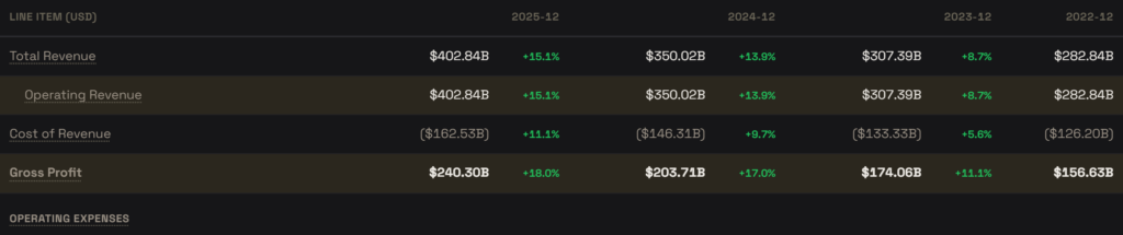
Income statement
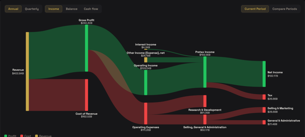
The income statement covers a span of time: revenue earned, the costs taken against it, and the profit left at each stage. In Current Period the chart draws it as a Sankey flow — revenue enters on the left and splits as it travels right. Green ribbons are what survives as profit, red ribbons are what is consumed as cost.
Revenue divides into gross profit and cost of revenue; gross profit into operating income and operating expenses; and, after interest and other items, into pre-tax income, then net income with tax branching off. Read left to right and you can see exactly where each dollar of revenue ends up.
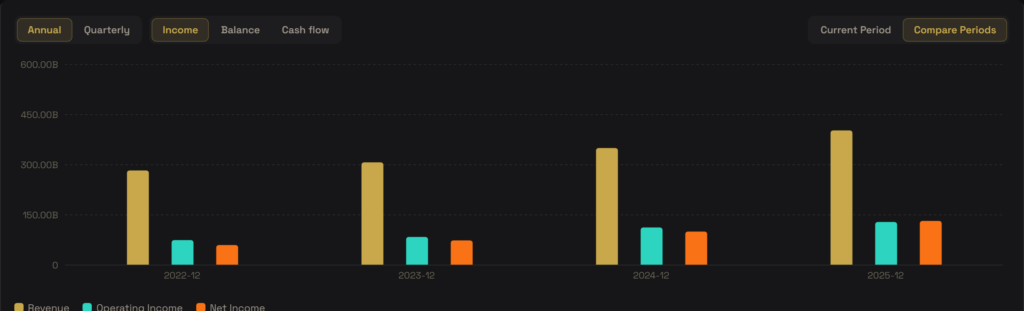
Switch to Compare Periods and the flow gives way to grouped bars of Revenue, Operating Income and Net Income across every period — the same headline figures, seen as a trend rather than a single snapshot.
Balance sheet
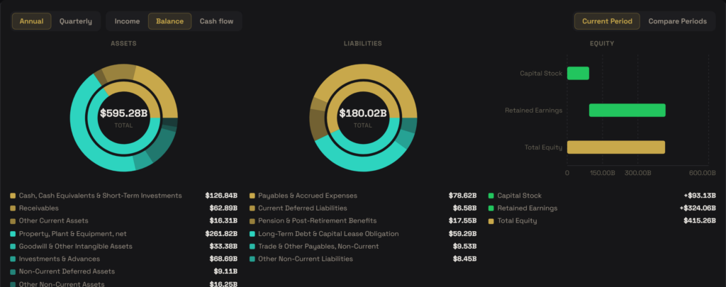
The balance sheet is a snapshot at period end: what the company owns (assets), what it owes (liabilities), and the equity between them. In Current Period the chart shows two donuts — Assets and Liabilities — each broken into its largest components with the total in the centre, alongside an Equity bridge that stacks the pieces building up to total equity.
A balance sheet should satisfy Assets = Liabilities + Equity. When the reported totals do balance, the chart simply shows the composition; when they don’t, a line spells out the mismatch rather than hiding it.
Compare Periods plots Total Assets, Total Liabilities and Total Equity as bars across periods, so you can see the sides grow or shrink over time.
Cash-flow statement
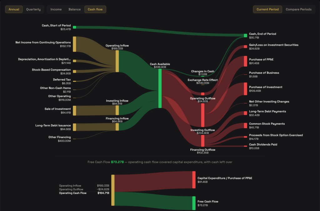
The cash-flow statement traces the actual cash that moved in and out over the period — a different question from profit. In Current Period the chart is a sources-and-uses Sankey: the opening balance and every inflow (from operating, investing and financing activity) converge on one Cash Available pool; every outflow fans back out of it; and what remains is the closing balance. A separate reconciliation lane carries the exchange-rate effect so the ending figure matches the filing.
Below the flow, a Free Cash Flow panel does one subtraction: operating cash flow minus capital expenditure — the cash a business generates after paying to maintain and grow itself.
Compare Periods shows Operating, Investing and Financing cash flow as bars across periods.
Common questions
From each company’s reported statements, pulled through FolioCenter’s market-data provider and shown as filed. The header names the reporting currency. Use the refresh control on the security to fetch the latest filings.
A line the company doesn’t report is hidden rather than shown as a dash, so the statement stays readable. Section headers with nothing beneath them are dropped for the same reason.
Parentheses mark a deduction — a cost or an outflow — following the statement’s own convention. The figure shows its magnitude; the brackets signal that it subtracts from the total above it.
Each figure carries its change from the previous period: green for an increase, red for a decrease. It is measured on a like-for-like basis, so a loss that narrows reads as a positive change.
That’s the toggle above the statement. Annual uses full fiscal years and is steadier; quarterly uses the latest quarters and is more current. Some companies report semi-annually, so their quarterly data can be sparse.
No. The Financials tab reports the company’s own numbers and draws them clearly. It offers no rating, target or recommendation — reading and judging the statements is yours to do.
These statements describe the companies you hold. To see how your own money is split across them — by asset class, region or any scheme you like — build a taxonomy.